- Project Name: Elite Language Services
- Use: Enhancing usability and accessibility to generate leads and improve client engagement
- Platform: Web & Mobile
- Timeline: May – Jul 2024 (3 months, extended due to stakeholder revisions)
- My Role: Product Designer
- Product Design Tools: Figma, Figjam, Trello
UX Case Study: Elite Language Services
Reimagining Elite’s Digital Presence
A New Approach to Lead Generation and User Experience
In April 2024, I joined Elite Language Services as their found a Product Designer to revamp their outdated website into a modern, user-centered platform. They needed more than just a website; they needed a strategic tool to connect with clients and grow their business. My role focused on leading the design process, collaborating with stakeholders, and delivering a scalable launchpad website.
Collaborators:
- Diego Díaz (Product Manager)
- José Bonifacio (CMO and former Elite’s website designer)
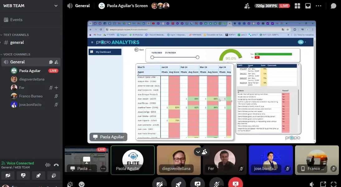
- Paola Aguilar (Operation team)
What’s Elite Language Services?
Elite Language Services specializes in online interpretation services, offering OPI (Over-the-Phone Interpretation) and VRI (Video Remote Interpretation) to bridge the language gap between English-speaking healthcare providers and LEP (Limited English Proficiency) patients. The company also aims to serve legal and business sectors, striving to deliver reliable, multilingual solutions.
Understanding the Problem:
The original website was outdated, lacked usability, and faced frequent accessibility issues due to poor security management. The unclear user journey made it difficult to attract and convert leads. Despite efforts to run marketing campaigns, the site failed to generate meaningful traction.
With plans for new campaigns set for July, a quick solution was needed. Stakeholders wanted a modern website to support these campaigns while ensuring the business could adapt to ongoing user needs.
My Responsibilities:
- Defined the product vision in collaboration with stakeholders to align the redesign with business objectives.
- Conducted user and secondary research to identify key pain points and opportunities for improvement.
- Led Scrum ceremonies, including Daily Stand-ups and Sprint Planning, to maintain an agile workflow.
- Designed high-fidelity prototypes and detailed handoff documents for the development team.
- Advocated for accessibility and usability, ensuring the new website met modern standards.
The Product
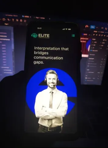
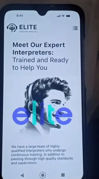
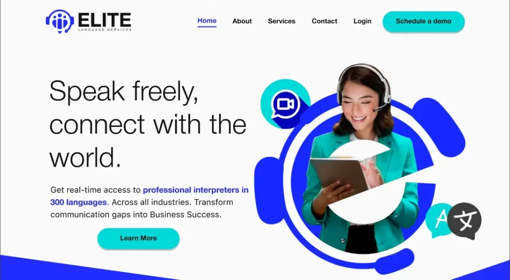
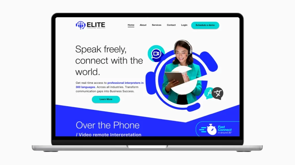
The new Elite Language Services website was designed as a functional, user-centered platform to attract leads in the medical, legal, and business sectors. The project’s first phase focused on delivering a launchpad website, providing the foundation for future iterations based on real user data.
The Goal
The primary objective was to create a website that:
- Attracted and converted leads effectively.
- Improved overall usability and accessibility.
- Supported the company’s growth strategy with a scalable and iterative design.
The Problem
The old website failed to meet the company’s needs due to:
- Poor usability and unclear navigation.
- Frequent security vulnerabilities that rendered the site inaccessible.
- A lack of alignment with accessibility standards.
- Inadequate data for making informed design decisions.
The Solution
We adopted a rapid approach to deliver a launchpad website that addressed immediate needs while providing a foundation for future improvements. Key actions included:
- Conducting secondary research and stakeholder interviews to align the design with business goals.
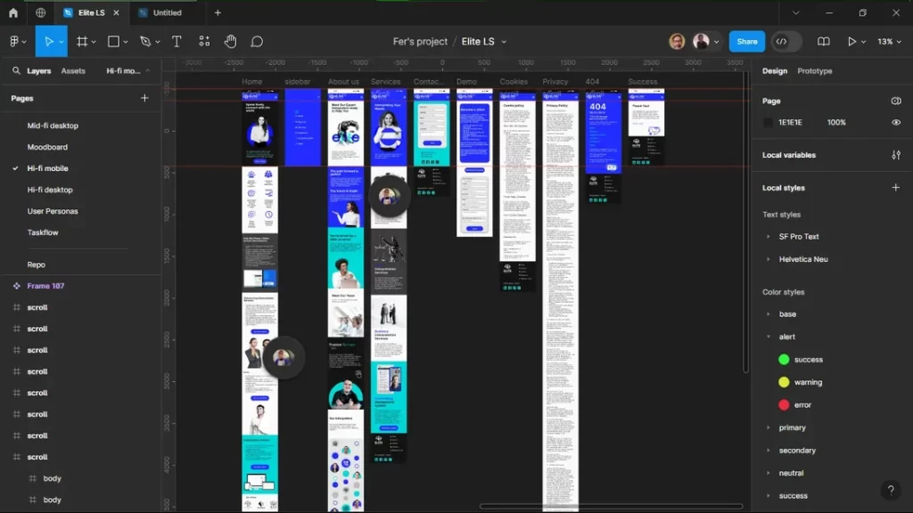
- Developing wireframes and prototypes that prioritized usability and accessibility.
- Incorporating tools for real-time data collection to guide iterative improvements in the next phase.
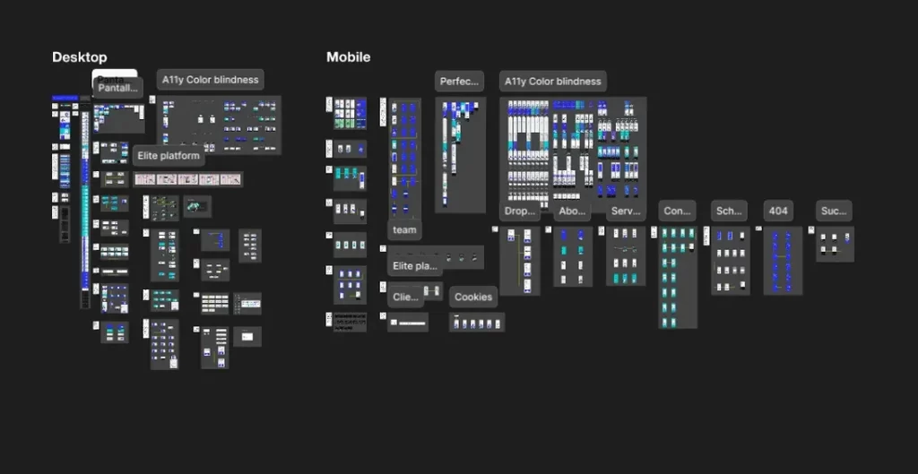
- Ensuring a responsive, modern design that could serve both desktop and mobile users.
Streamlining Elite’s Online Presence
When Elite Language Services set out to redesign their website, the project was more than just a visual upgrade—it was a fundamental shift to align the company’s digital presence with its business objectives. The goal was to create a user-centered platform that generated leads while addressing accessibility and usability issues. However, the path to achieving this vision was filled with challenges.
Building a Foundation for Change
Stakeholder Meetings: Aligning Goals and Vision
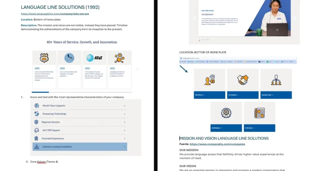
To kick off the project, I worked closely with stakeholders to clarify Elite Language Services’ mission and vision. Through in-depth discussions, we aligned their evolving business objectives with current market demands. This collaboration resulted in updates that strengthened the connection between their core services—medical, legal, and business interpretation—and their target audience, ensuring a focused strategy for lead generation.
Why this approach?
Through collaborative discussions, we honed in on three primary areas of focus: medical, legal, and business interpretation. By narrowing the scope to these core services, the team could concentrate on generating quality leads while laying the groundwork for future growth.
Competitor Analysis: Spotting Opportunities
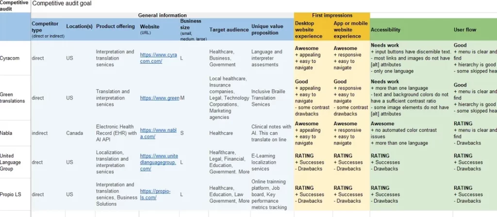
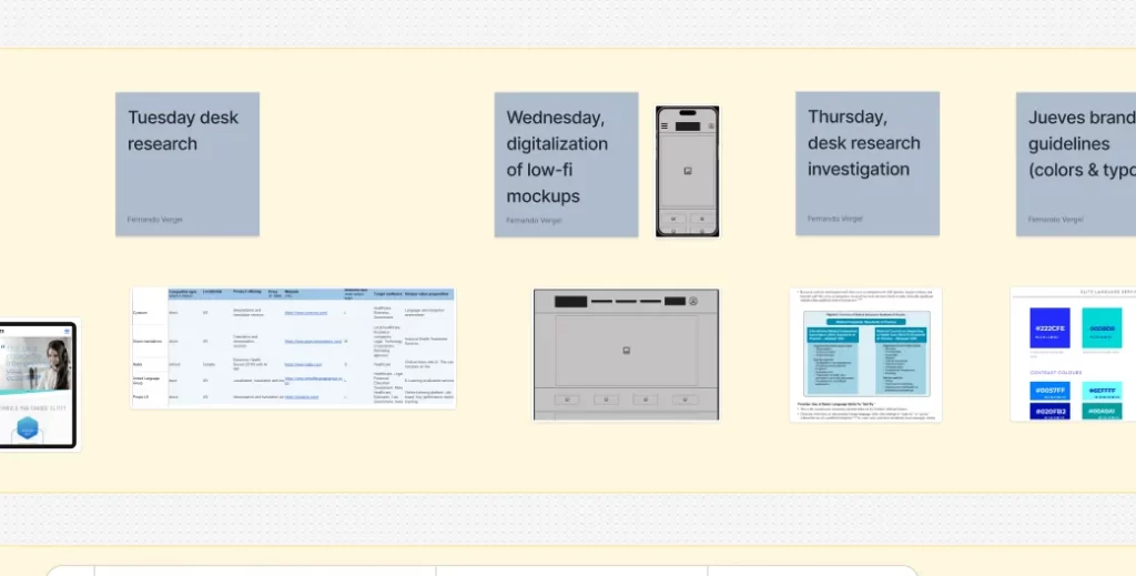
Through secondary research, I analyzed competitors’ strengths and weaknesses to uncover opportunities for differentiation. Key findings revealed that many competitors struggled with unclear navigation and complex booking processes, while accessibility features were often neglected. These insights allowed Elite to focus on creating a streamlined, inclusive, and user-friendly experience to better serve its audience.
Why this approach?
These insights became the foundation for shaping a design strategy that prioritized ease of use, accessibility, and a user journey tailored to Elite’s potential customers.
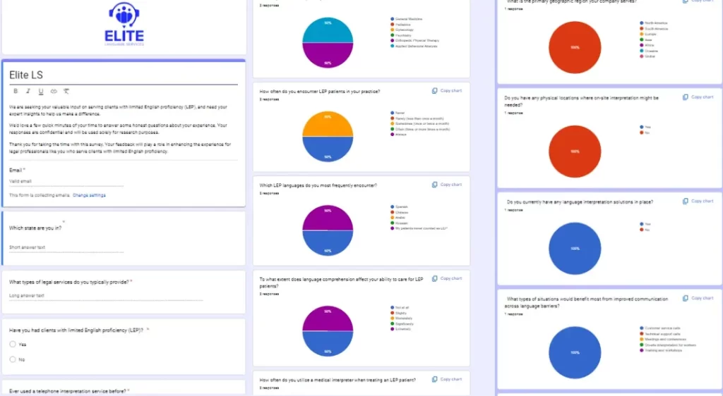
User Surveys: Gaining Initial Insights
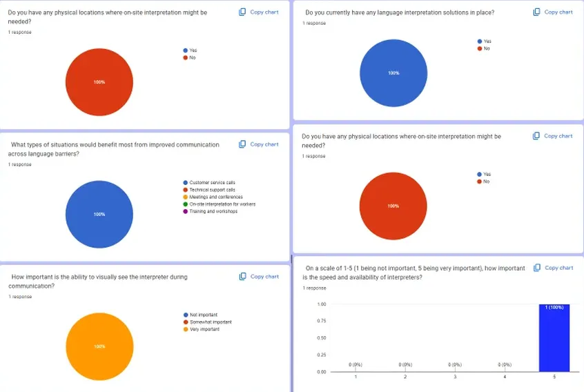
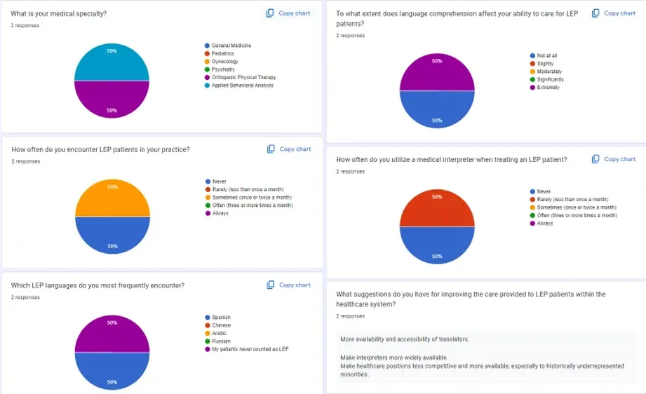
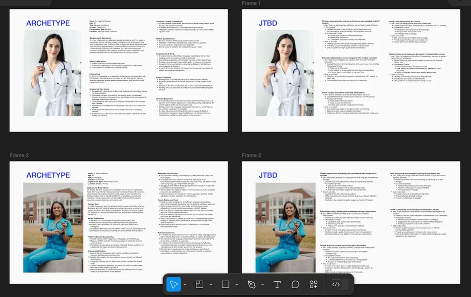
Through surveys targeting healthcare providers, legal professionals, and businesses, I gathered critical insights into their specific needs and priorities. Healthcare providers highlighted the necessity for simplified interpreter booking and better availability. Legal professionals emphasized the need for reliable and accurate interpretation to foster clarity and trust in their work. Businesses prioritized cost-effectiveness and speed, expressing strong interest in OPI and VRI solutions to optimize their operations. These findings provided a foundation for addressing user needs effectively.
Why this approach?
These insights formed the backbone of our design strategy, allowing us to address specific user concerns while aligning with Elite’s business goals.
Adopting Agile: An Organized Approach
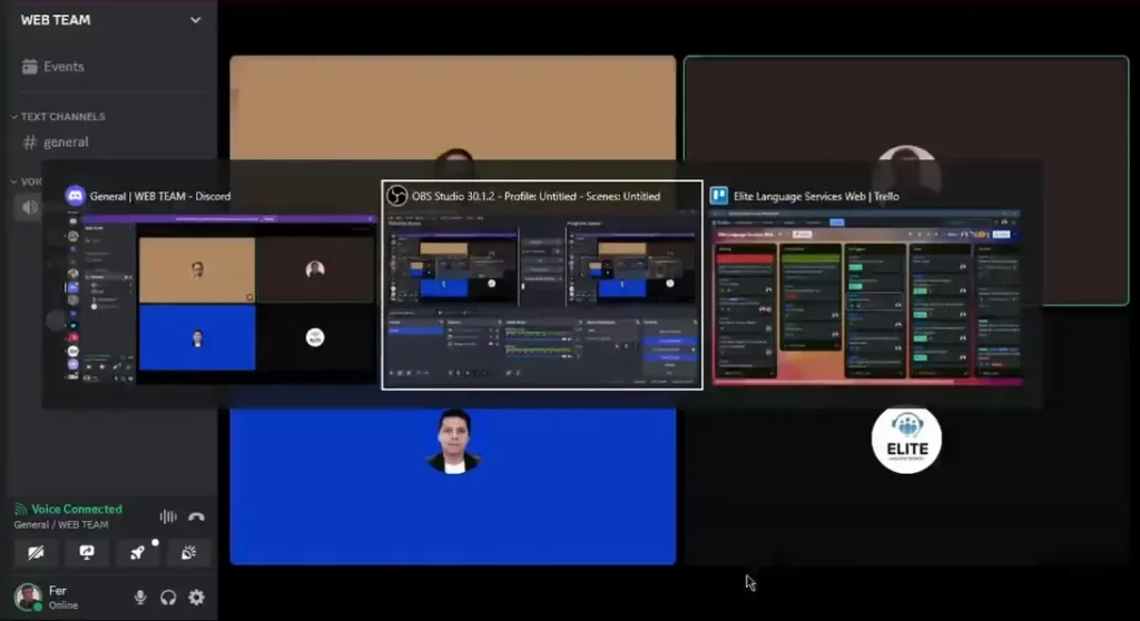
To ensure adaptability and maintain project momentum, I introduced Agile methodologies with a focus on Scrum ceremonies and structured sprints. Daily stand-ups, sprint planning, and retrospectives fostered clear communication and proactive problem-solving. Using Trello for task tracking ensured transparency and alignment across the team, keeping workflows efficient and organized.
Why this approach?
This organized approach not only streamlined our workflow but also fostered a collaborative environment that kept the project moving forward despite tight deadlines and unforeseen challenges.
Sketching the Vision
From Sketches to Wireframes
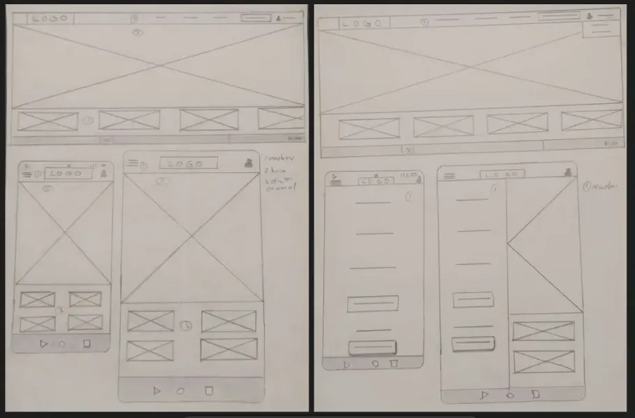
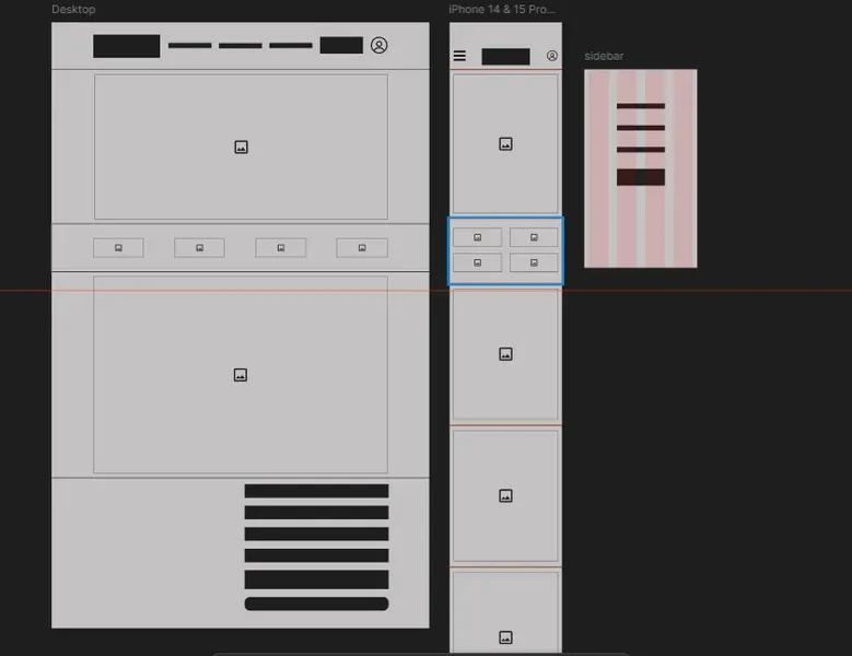
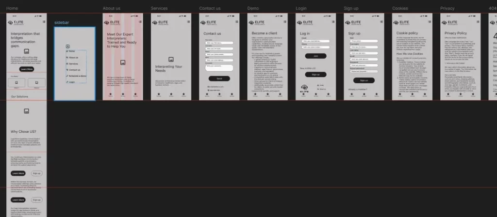
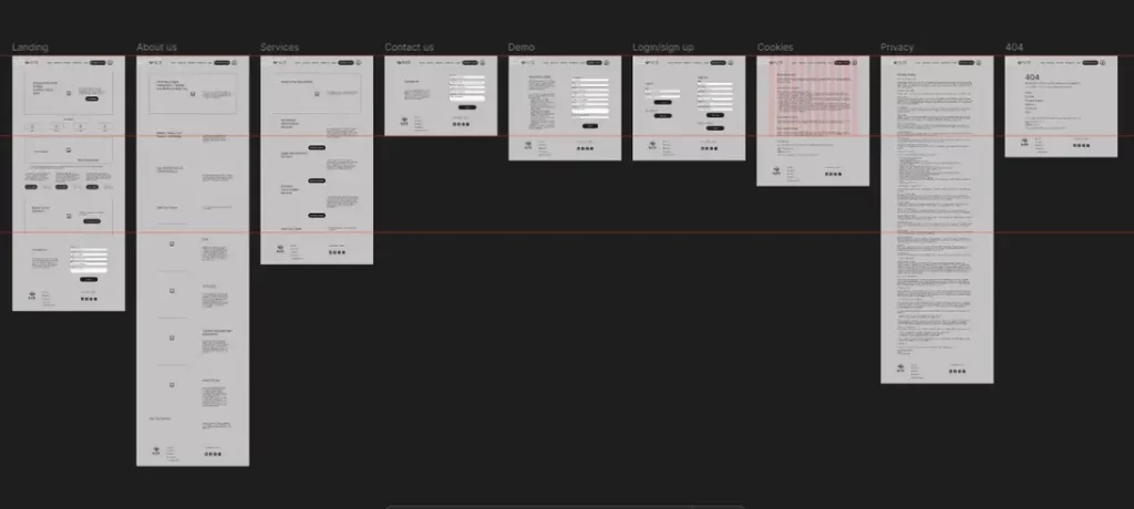
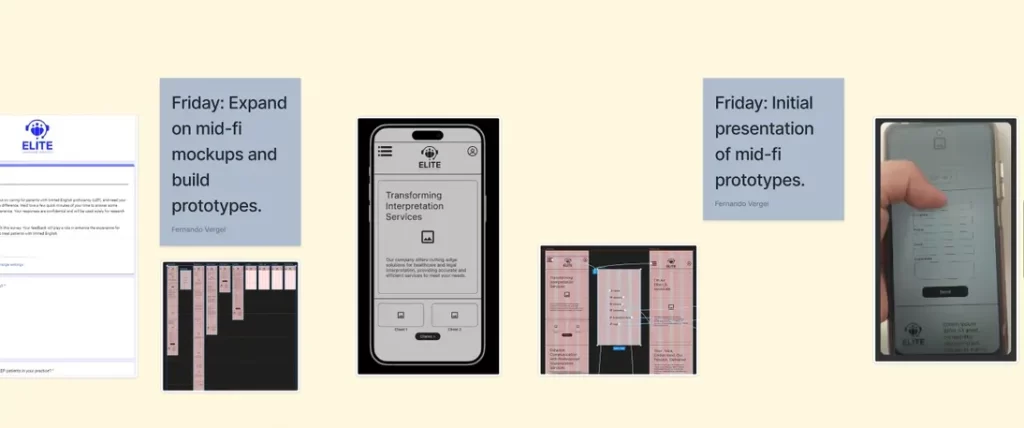
Starting with hand-drawn sketches, I visualized the initial structure and flow of the website, enabling quick iterations based on stakeholder feedback and user insights. These ideas evolved into low-fidelity wireframes, creating a scalable and accessible foundation for the design. The wireframes facilitated collaborative discussions, refining the direction early and ensuring alignment with the project’s goals.
Why this approach?
This phase sets the groundwork for a user-centered design approach, ensuring that the project progressed in a structured yet flexible manner.
Structuring Content
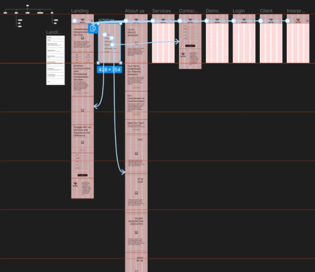
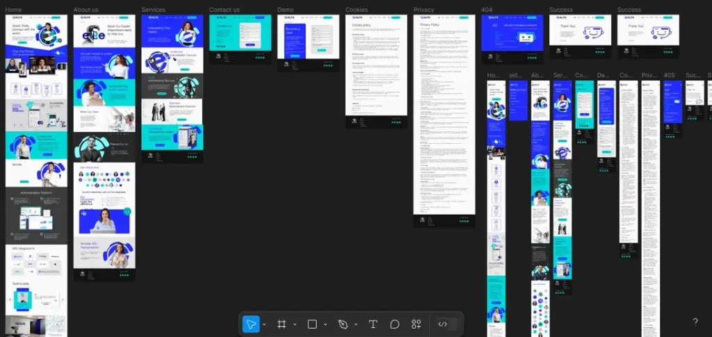
I defined the site’s architecture by logically organizing content across sections, ensuring it aligned with user needs and business goals. By mapping out key content areas and determining the number of screens required, I balanced simplicity with depth. This structure facilitated seamless navigation, guiding users intuitively to Elite’s services or company information without compromising on detail or engagement.
Why this approach?
This phase was about more than just organizing information; it was about creating a cohesive experience that felt effortless for users. A well-structured site not only improved usability but also laid the groundwork for future enhancements, making it easier to expand or adapt the platform as new needs arose.
Web accessible for all
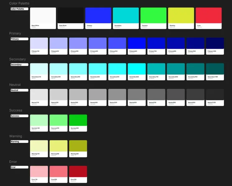
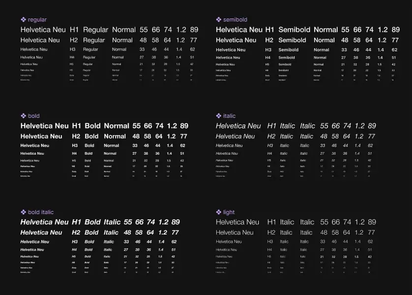
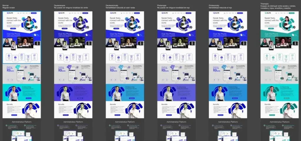
Accessibility was a cornerstone of this project, emphasizing inclusivity and usability. I rigorously tested the color palette to ensure compliance with accessibility standards, addressing contrast and readability for users with visual impairments. Typography was carefully refined by defining weights and sizes for headings, body text, and buttons, creating a clear visual hierarchy. These adjustments ensured the site was both navigable and professional, accommodating users relying on assistive technologies like screen readers.
Why this approach?
Accessibility and clarity are not just about meeting standards; they’re about building trust and ensuring every user has an equal opportunity to engage with the platform. By prioritizing these elements early, the site became more inclusive and adaptable for future enhancements.
Prototyping and Team Feedback
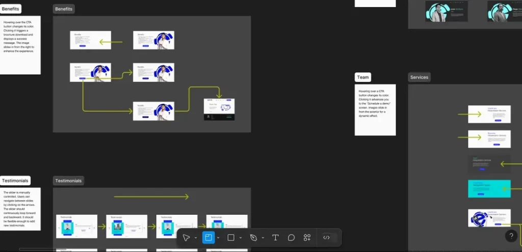
Low-fidelity prototypes brought the design to life, illustrating user flows and website goals for stakeholders. Presenting these prototypes initiated valuable discussions, allowing for constructive feedback that refined the project’s direction. Close collaboration with the Product Manager and key decision-makers ensured alignment with objectives while addressing areas for improvement, such as layout adjustments and usability enhancements, to better meet user expectations.
Why this approach?
This iterative process helped solidify a shared vision for the project, ensuring that everyone was aligned before advancing to the next stage. By incorporating feedback early on, we minimized the risk of major revisions later and created a strong foundation for further development.
Elevating the Experience
Refining Visuals
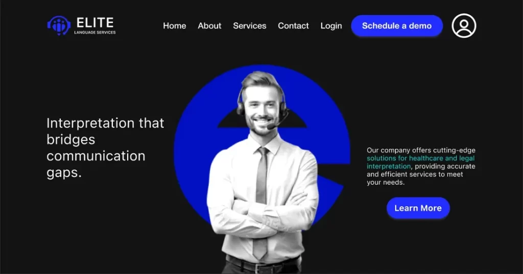
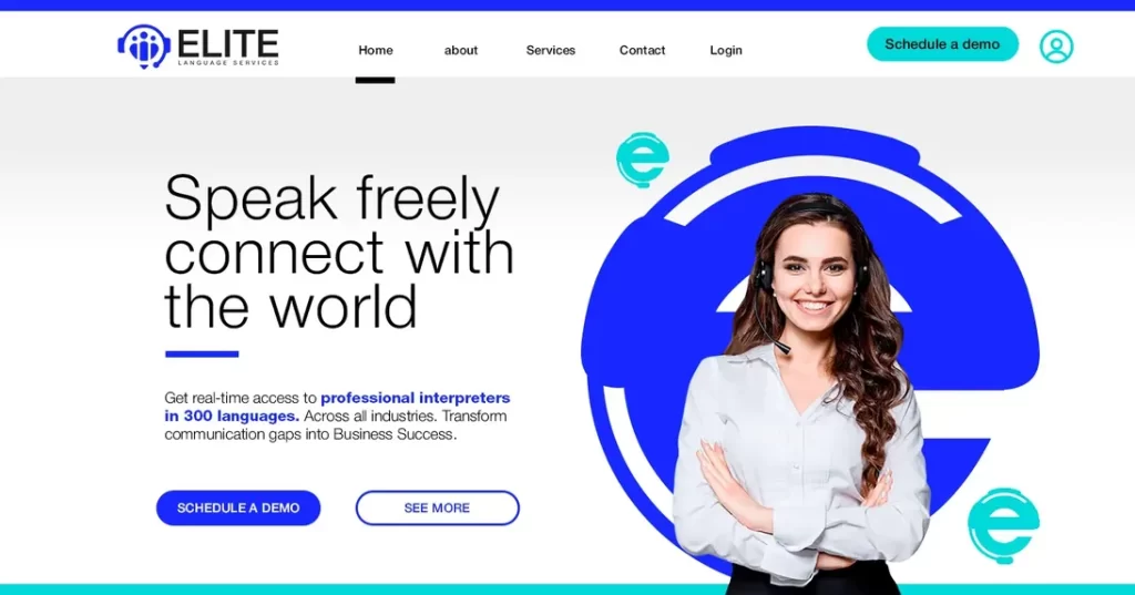
Refining the visuals involved balancing aesthetics and functionality. I selected color combinations with appropriate contrast ratios to support users with visual impairments, such as color blindness, while aligning with Elite’s branding. Typography was carefully curated with distinct sizes and weights for headings, subheadings, and body text, ensuring readability and a clear visual hierarchy. Every element, from button styles to background shades, was optimized for seamless usability and accessibility across assistive technologies.
Why this approach?
This phase wasn’t just about making the site look polished; it was about creating a platform that embodied Elite’s commitment to professionalism and user-first design. By prioritizing inclusivity at every step, we ensured that the website could serve a diverse audience effectively, setting a strong standard for accessibility and usability.
Content and Feedback Integration
With the visual structure in place, I crafted meaningful content that aligned with the site’s goals and user needs. Drawing from research, I highlighted Elite’s services and value propositions in a professional yet approachable tone. Collaboration with the product team ensured the messaging reflected the brand’s identity, while feedback from stakeholders helped refine clarity and engagement throughout the design.
Why this approach?
Through iterative adjustments, we maintained a strong user focus, ensuring that every element of the site—from the headlines to the calls-to-action—contributed to a seamless and impactful experience. This collaborative refinement not only strengthened the design but also ensured that it resonated with the diverse audience Elite aimed to serve.
Navigating the Unknown
Constant Stakeholder Changes
The project faced challenges with evolving stakeholder preferences, including repeated color scheme changes and adjustments to homepage sections and typography. These shifts required flexibility and swift decision-making to maintain design consistency and accessibility. Open communication and thoughtful solutions turned these obstacles into opportunities to refine the website, ensuring a cohesive, user-focused, and visually appealing design.
Project Impact
The iterative nature of the project led to delays and frequent reworking of the information architecture to address evolving stakeholder demands. Despite these challenges, each revision became an opportunity to reassess priorities and refine the design. Open communication and creative problem-solving allowed the team to balance stakeholder preferences with user-focused goals, ultimately delivering a cohesive design that enhanced the user experience and supported Elite’s growth objectives.
Balancing Accessibility and Aesthetics
Maintaining accessibility as a non-negotiable standard, I educated stakeholders on its importance while proposing compromises to align aesthetic preferences with usability requirements. By bridging design ambitions with technical standards, features like contrast ratios, readable typography, and compatibility with assistive technologies were preserved. Documenting decisions ensured transparency and accountability, reinforcing the website’s commitment to inclusivity and serving a diverse audience effectively.
Development Challenges
The lack of a development team at the project’s start caused misalignments that surfaced during the handoff phase, demanding clear communication and technical oversight. When external developers joined later, their limited expertise required additional guidance and collaboration with stakeholders. This experience emphasized the need for early developer involvement and stronger onboarding processes to ensure smoother implementation in future projects.
Impact by the Numbers
The strategies implemented at Elite Language Services resulted in measurable improvements despite data collection limitations. Insights from initial research influenced key design decisions, such as improving usability for healthcare providers seeking simpler booking processes and better availability. Business-focused respondents highlighted cost-effectiveness and speed, shaping accessibility and functionality enhancements. Although legal sector responses were absent, this underscored the need for stronger outreach in future research. The launchpad website now facilitates ongoing user data collection to drive continuous refinement and evolution based on real behaviors.
Overcoming Barriers to Create a User-Centered Platform
Despite significant challenges, the project resulted in a design that adhered to modern accessibility standards and positioned Elite Language Services for future growth. The launchpad website provides a scalable foundation, allowing the company to iteratively improve and gather real user data to refine its offerings.
By prioritizing collaboration, flexibility, and a user-first mindset, this project exemplifies how strategic adjustments can overcome roadblocks and align digital experiences with business goals.
Recommendations
- Foster Clear Communication and Negotiation: Establishing strong communication practices and negotiation skills is essential to managing evolving demands while keeping the project aligned with its objectives.
- Integrate Accessibility from Day One: Prioritizing accessibility as a foundational element from the start avoids costly revisions and ensures the final product is inclusive for all users.
Let’s Connect!
Want to check out the project in more detail?
Just click here: Link
Let’s craft user-centered experiences that drive real results. If you’re looking for a Product Designer who bridges UX strategy and web redesign, let’s connect. I’d love to bring this expertise to your next project.
Reach out on WhatsApp, LinkedIn, GitHub, or Behance, or drop me an email at fernandovergel@gmail.com.

