- Project Name: Eureka
- Use: Transforming online education by connecting with experts worldwide
- Platform: Web & Mobile
- Timeline: Mar – Apr 2024 (5 weeks)
- My Role: Product Designer
- Team Size: Initially 18, streamlined to 14
- Collaborators: Cross-functional team (Front-end, Back-end, QA, PM)
- Product Design Tools: Figma, MarvelApp, Photoshop, Optimal Workshop
UX Case Study: Eureka
Transforming Online Learning Experiences
Overview:
Eureka is an e-learning platform designed to democratize education by connecting learners with experts in various fields. Over a five-week timeline, I led the design process, focusing on creating an intuitive, responsive, and user-centered experience.
Problem Statement:
Users and educators faced significant challenges with existing online education platforms, including:
- Lack of interactivity and customizable learning modules.
- Limited community features to connect like-minded learners and instructors.
- Difficulty in managing courses and tracking progress efficiently.
So what? Addressing these pain points was crucial to enhancing user engagement and satisfaction, ultimately driving the platform’s growth and adoption.
My Role:
As the Product Designer, I was responsible for:
- Conducting user research and synthesizing insights.
- Designing the responsive UI/UX for both web and mobile.
- Collaborating with cross-functional teams using the Scrum framework.
- Creating and maintaining the UI kit and adhering to accessibility standards.
Transforming Online Learning Experiences
Eureka is an e-learning platform designed to democratize education by connecting learners with experts in various fields. Over a five-week timeline, I led the design process, delivering an intuitive and responsive platform that caters to the needs of both learners and educators.
The Goal
Our aim with Eureka was to create a platform that offers a seamless, engaging, and community-driven educational experience. We set out to meet user needs while building a scalable product that stands out in a crowded market.
The Problem
Existing online education platforms were failing to engage users effectively, lacking both interactivity and a sense of community. Users reported a fragmented experience and a disconnect between learning paths and user goals.
The Solution
We developed a user-centered platform with interactive modules, responsive design, and strong community features, directly addressing the needs expressed by our prospective users.
The Product
Designing a fully functional and innovative e-learning platform in just 5 weeks was no small task. The goal was to bridge the gap between educators and students, offering a solution that was not only visually appealing but also responsive and accessible. With tight deadlines and evolving requirements, I needed to employ agile design processes and maintain close collaboration with the development teams.
Week 1: The Spark of an Idea
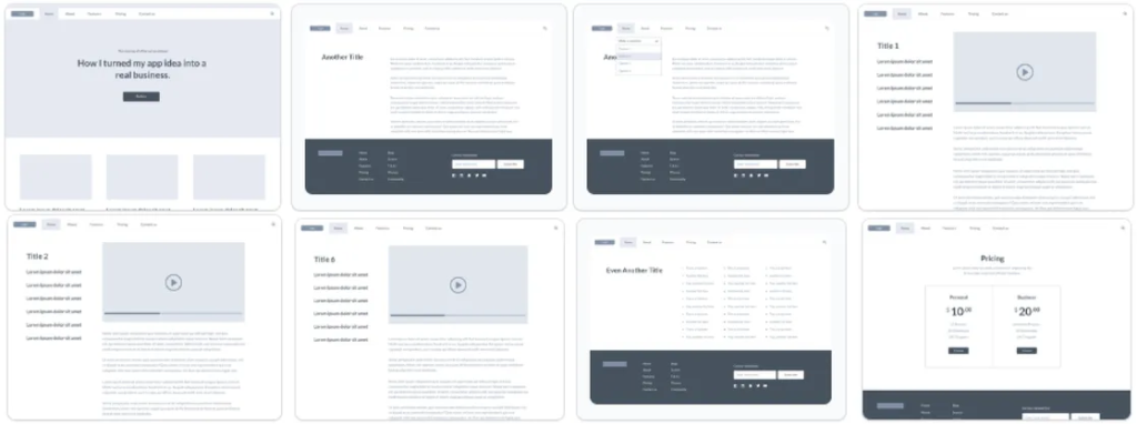
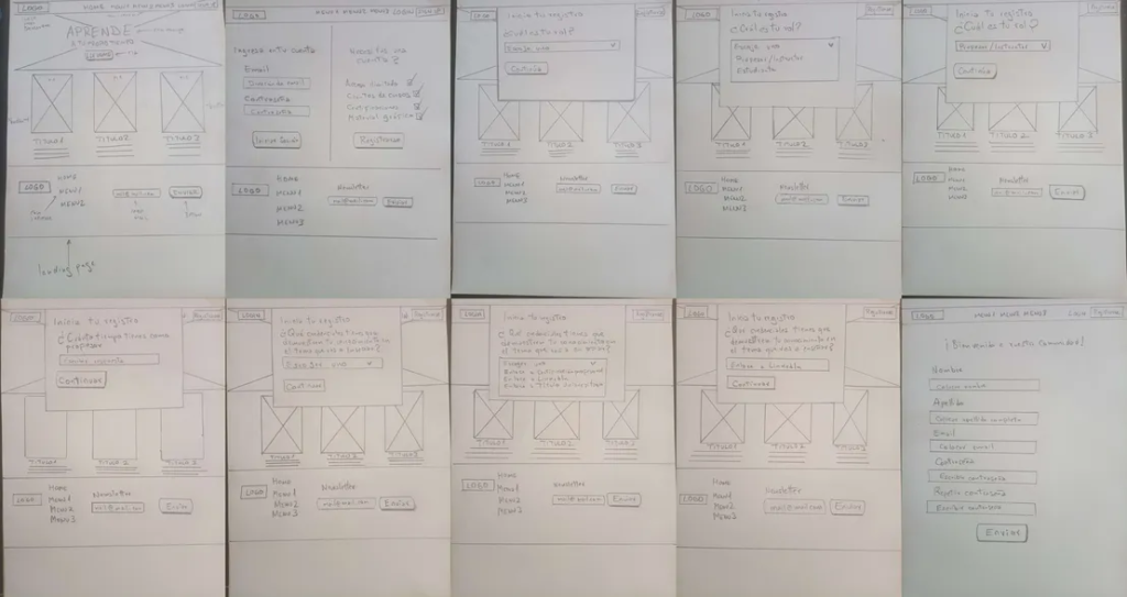
The first week was all about groundwork. I conducted intensive desk research to understand the current e-learning landscape, identifying trends and key competitors. Using the Crazy 8s brainstorming technique, I generated multiple design concepts, quickly sketching out ideas.
To validate our direction, I launched quick surveys targeting educators and students. This early user feedback was crucial for shaping the initial design.
What I Did:
- Created lo-fi wireframes in Figma for early visualization.
- Established processes with the PM using Scrum for efficient iteration.
- Developed mockups in MarvelApp for initial alignment with the dev team.
Why this approach?
I chose this approach because it allowed me through desk research and surveys, understand user needs and market trends, guiding our design decisions. “Crazy 8s” facilitated rapid idea generation, while Scrum ensured an efficient workflow. Developing lo-fi wireframes in Figma enabled early visualization and iterative layout refinement.
Week 2: Turning Insights into Action
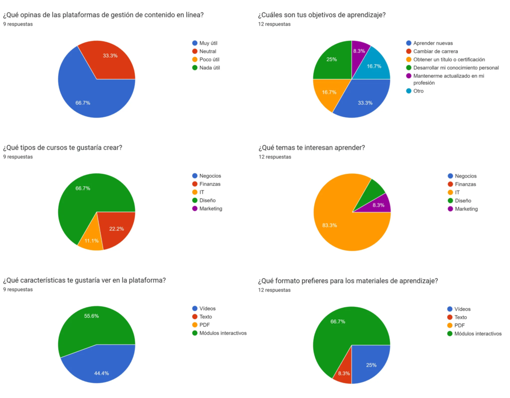
Armed with survey data, I collaborated with the PM and QA to refine user stories. The most requested features were interactive course modules and a responsive dashboard.
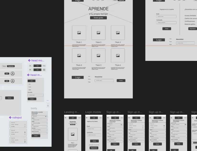
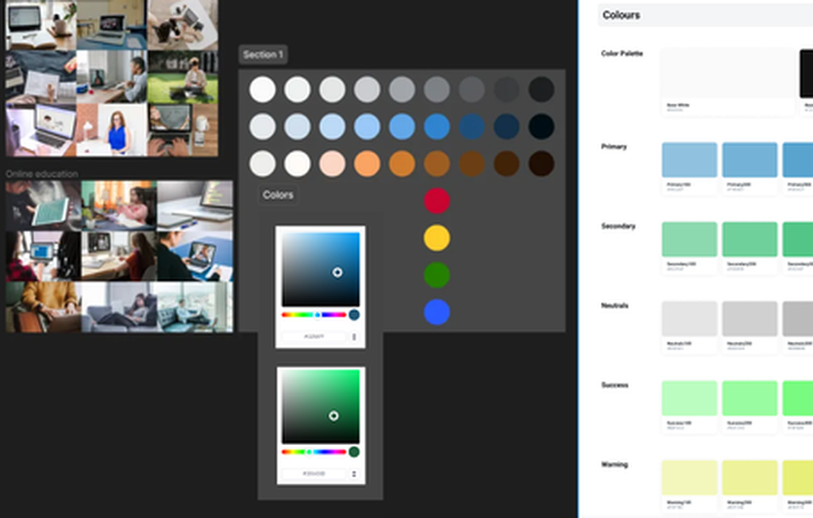
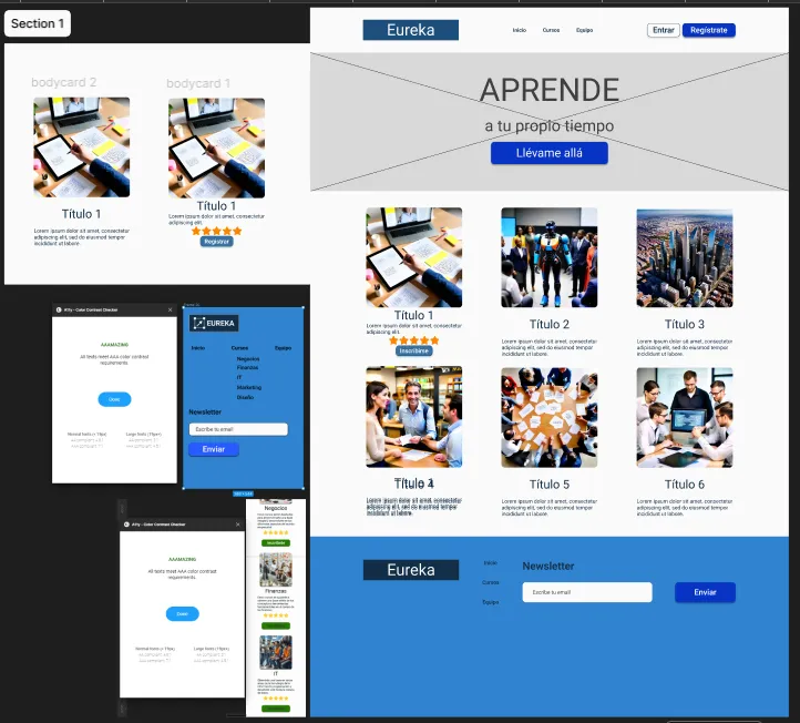
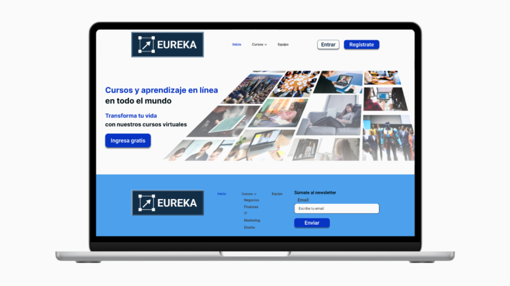
I developed a mood board to align the visual style and created mid-fi wireframes for key screens like the homepage, login, and registration. Each element was designed with user feedback in mind, aiming for clarity and ease of use.
What I Did:
- Analyzed survey results and adjusted design elements accordingly.
- Created a cohesive visual theme with a mood board.
- Built mid-fi wireframes, integrating real content for a realistic feel.
Why this approach?
Identified key user needs from survey results and finalized user stories with the PM and QA. Created a mood board to set the color scheme and developed key wireframes. Next enhanced these wireframes to medium fidelity with real text content to ensure clarity and alignment with user expectations.
Week 3: Refining the Experience
Despite a setback due to a low back pain episode, I ensured the project stayed on track by relying on detailed design documentation. The front-end team continued development based on my MarvelApp prototypes.
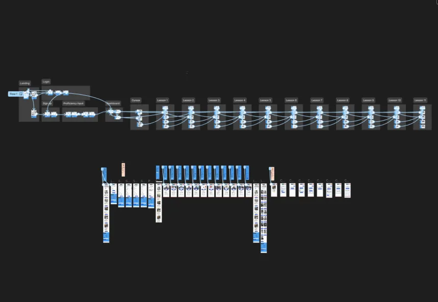
This week, I focused on refining the information architecture and user flow, ensuring a seamless experience from sign-up to course completion. I also began transitioning screens from mid-fi to hi-fi, incorporating the visual identity elements.
What I Did:
- Structured user flows and enhanced information architecture.
- Moved key screens to high-fidelity design, integrating Eureka’s brand elements.
- Generated AI-based images for course illustrations, speeding up the design process.
Why this approach?
Despite a setback with low back pain, the front-end team relied on my mockups and Marvelapp prototypes to move forward effectively. I focused on refining information architecture, integrating the platform’s visual identity, and advancing screens from mid-fi to hi-fi.
Week 4: Bringing the Design to Life
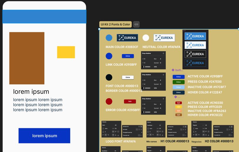
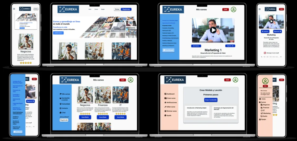
This was the most intensive week. I finalized the hi-fi mockups, ensuring the color palette met accessibility standards. I developed a complete UI kit and polished the platform’s visual identity, including the logo.
Key dashboards for students and educators were designed with responsiveness in mind, offering a seamless experience across desktop and mobile devices. I worked closely with front-end developers to address any design inconsistencies and prepared for the upcoming demo day.
What I Did:
- Finalized hi-fi mockups for all screens, focusing on responsive design.
- Created a comprehensive UI kit for consistent implementation.
- Led dashboard design, ensuring it met user needs and business goals.
Why this approach?
Crafted high-fidelity mockups for desktop and mobile, prioritizing responsive design, ensured accessible colors including the logo and UI kit. Developed detailed dashboards for educators and students in high fidelity, ensuring readiness for demo day.
Week 5: Final Touches and Demo Day
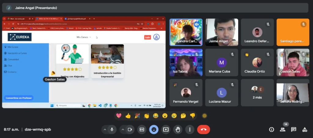
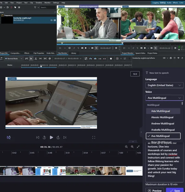
The last week was dedicated to refining details and preparing for demo day. I collaborated with the PM on creating a compelling demo video, using KDEnLive for editing and AI-generated voiceovers from Clipchamp.
With all screens and prototypes completed, I facilitated a final review with stakeholders, making adjustments based on feedback. The platform was well-received during the presentation, highlighting its intuitive design and robust features.
What I Did:
- Polished final screens and prototypes for both desktop and mobile.
- Co-created the demo video to effectively showcase the platform’s functionality.
- Gathered feedback and made last-minute improvements before the launch.
Why this approach?
I finalized refinements with development teams, prototyped the platform for desktop and mobile, and prepared the demo day video in collaboration with the PM.
The Ripple Effect of Design
In just five weeks, we delivered a fully functional MVP of Eureka. The platform launched with five key course modules (IT, Business, Finance, Design, and Marketing) and featured an intuitive user interface that allowed seamless course management. While additional features like support forums are planned for future iterations, the feedback from demo day was overwhelmingly positive.
Key Outcomes:
- 83.3% of students expressed satisfaction with the course selection.
- A significant portion of educators (66.7%) found the platform’s management tools highly effective.
- The project was completed on time, showcasing a high level of collaboration and agile problem-solving.
The Legacy of the Project
The launch of Eureka proved that a user-centered, agile approach could deliver a product that not only meets but exceeds expectations. The project’s strong foundation paved the way for future enhancements, focused on deepening community features and expanding course offerings.
Reflections from the Journey
Takeaways
This project underscored the importance of agile problem-solving and the value of early user feedback in shaping product design. By trusting my team and focusing on iterative improvements, I was able to navigate setbacks and deliver a successful product.
Lessons Learned
- Deep user understanding drove every major design decision, shaping a product that genuinely met user needs.
- Agility in Action, even during unforeseen setbacks, kept the project on track without compromising quality.
- Teamwork and open communication turned challenges into opportunities, resulting in a product we were all proud to deliver.
- Effective delegation enhances team productivity and project quality, not just for user design but for team dynamics.
- Focusing on a viable MVP rather than perfection allowed us to launch quickly and gather real user feedback for future iterations.
Let’s Build the Future Together
Want to check out the project in more detail?
Just click here: Link
Great design goes beyond visuals – it empowers people. I lead teams to build solutions that make a real difference. Let’s talk about your next big idea and how we can make it happen together.
Reach out on WhatsApp, LinkedIn, GitHub, or Behance, or drop me an email at fernandovergel@gmail.com.

